La Madeleine
Making the French fresh.
Overview
La Madeleine had an extremely outdated website and knew it was time to both update and upgrade. Looking to target a younger demographic, La Madeleine asked that our team create something that spoke to Millennials without forgetting their legacy users.
Role & Duration
Visual Designer | T3
Visual Design, Design System
Summer 2018
Problem
La Madeleine’s website no longer fit their needs. Because it was so outdated, stakeholders had no way of changing any of the content on the site. The company also wanted to introduce online ordering but because of the site was so dated, there was no way to integrate with any third party vendors that handle online ordering.
The Before
The La Madeleine website was extremely dated and due for an update. The navigation was confusing and the UI needed a refresh.
Workshopping
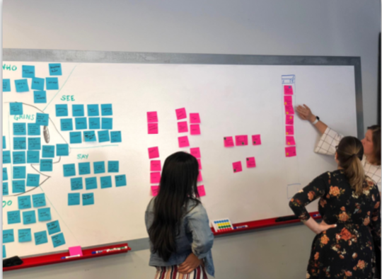
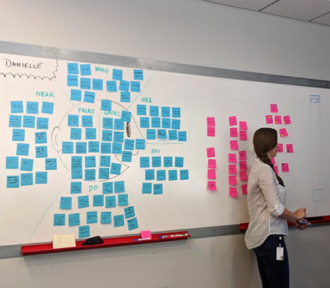
The project started with multiple workshops with the client to understand how they wanted to present the brand.


Laying the Foundation
The site was largely built based on the principles of atomic design. The main idea behind this ideology is small pieces can be combined to create larger component structures that are reusable throughout a system. Because of the choice to create an ADA compliance toggle, this particular system had two stylesheets.
Grid
A basic 8 point grid was created to start the system.
Color Palette
Our palette was based on La Madeleine’s current brand colors. We also created a guide to help stakeholders understand how to be AA compliant in anticipation of expanding the brand’s digital presence.
Typeface
Raleway was out only typeface, as defined by the client. We used various weights to create contrast and outlined how the type should be structured. We created guidelines for both desktop and mobile typographic styles. Unless dictated by the stylesheet, mobile styles mirrored desktop.
Buttons
Because of the AA compliance toggle, two sets of buttons were created with different colors to reach contrast standards.
Standard Buttons
ADA Compliant Buttons
Form Elements
At the time of the project, La Madeline had no need for any input elements but we designed them for future needs.
And many more….
Organizing Ideas
Wireframes were presented to the stakeholders to understand content hierarchy and structure.
Making It Visual
Once approved, final styling and images were applied to give it the La Madeline look and feel.
Pulling it All Together
All these elements were combined to create various components. These components were then used to build pages for the site.
The Handoff
All components and designs were handed off via Zeplin.


