Waste Management
Reimagining the way we talk about waste.
Overview
Waste Management had an outdated website they were looking to refresh. The goal was to consolidate their numerous micro-sites and refresh their online experience.
Role & Duration
Visual Designer | T3
Visual Design, Component Design
Spring 2019
Problem
Waste Management’s online presence was extremely disjointed. Multiple micro-sites and an inconsistent brand led to a disconnected experience and loss in sales partially from user confusion.
Defining styles
Color Palette
Colors from the brand were adjusted slightly to reach AA WCAG standards on the web.
Typography
A new typeface for digital was chosen, DIN OT. Guidelines were defined for both desktop and mobile experiences.
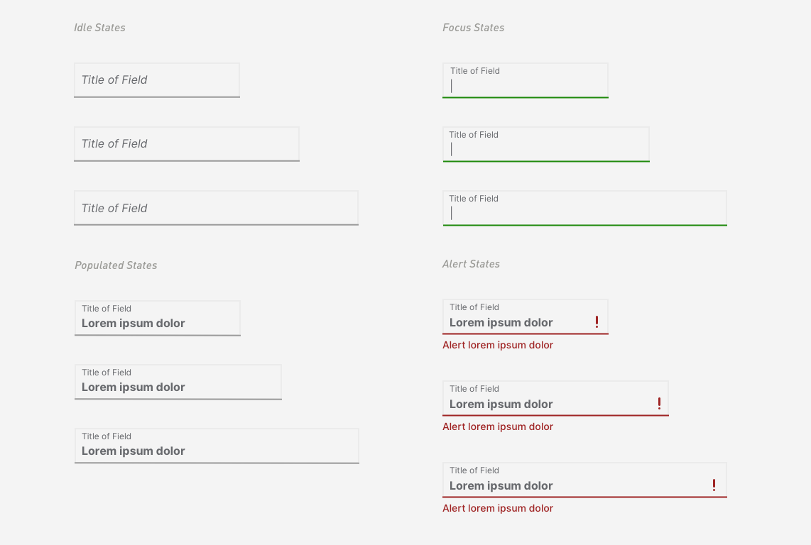
Inputs
Defining form elements ensures the same interaction experiences across all products.
Icons
I suite of icons was created to elevate the visual language of the brand.
Component Based Design
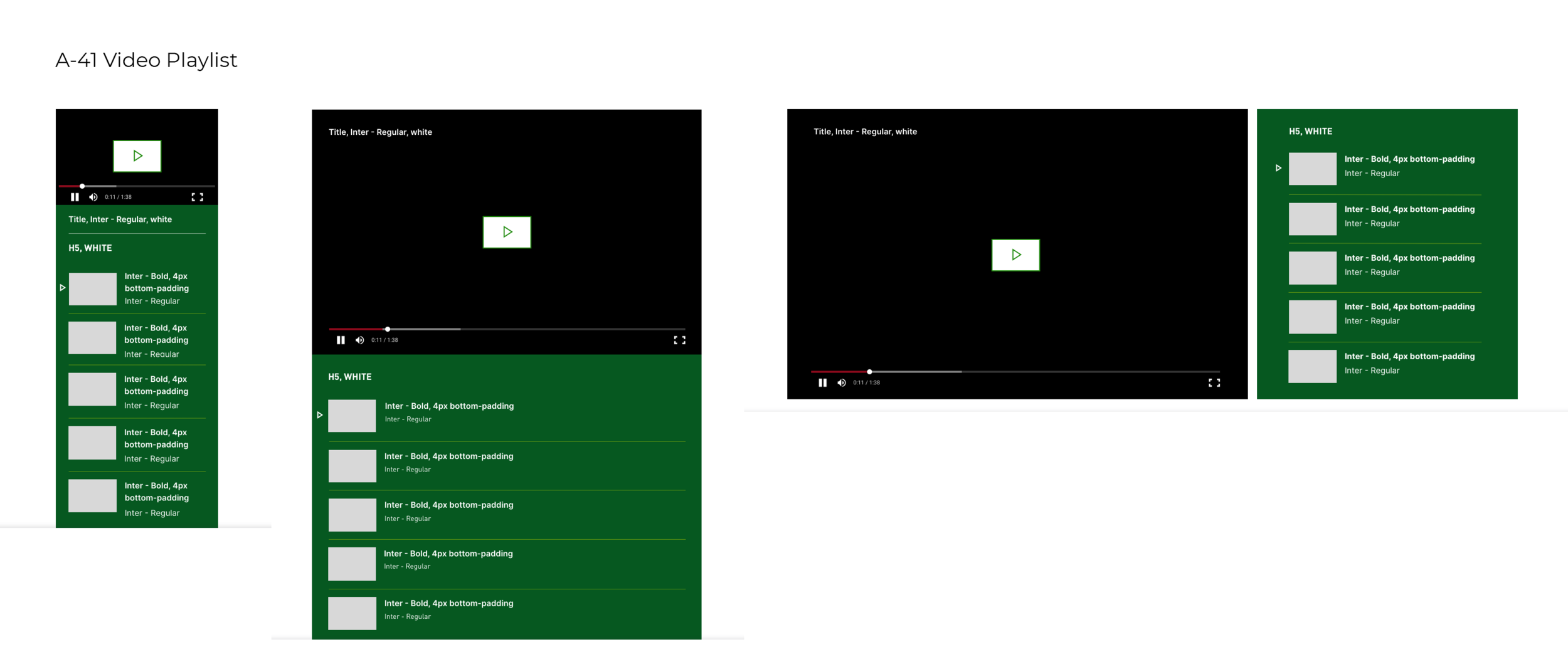
Once all the elements were completed, components were built to be used as interchangeable parts throughout the site experience.
Spec the Work
Spec sheets were created for each component for development.
Pulling it All Together
Components were combined to build pages simply. With this system the team was able to create pages quickly.


